Inyova Website Redesign
Company
Inyova
Role
Product Designer
Responsibilities
Website strategy & structural redesign
Information architecture
Scalable design system foundations
User research, testing & iteration
Accessibility & performance improvements
Context
Inyova is a leading Swiss sustainable-investing platform whose website needed a redesign to better serve its growing user base and evolving product offering. As Lead Designer, I created a clearer user journey, simplified the site’s structure, and built a design system for a consistent, accessible experience. Acting as interim PM during the design–marketing phase, I aligned stakeholder expectations and ensured user needs remained at the center of every decision throughout the project.


Challenge
Inyova’s website was built in 2018 when the company first launched. It worked in the early stages, but as the product and user base expanded, its limitations became clear:
Users often struggled to locate information quickly, creating friction in the user journey.
Adding new subpages was time-consuming, making the site hard to scale.
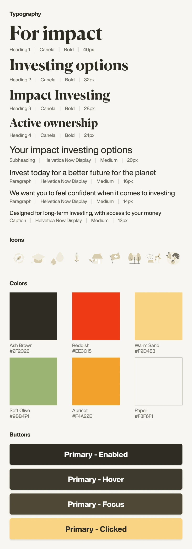
A lack of a design system and clear information architecture left the site disorganized. With no typography scale, there were over 50 inconsistent font variations.
The marketing team manually adjusted article layouts, causing variations and inconsistent design.
Functionality gaps and missing accessibility standards created usability barriers.
SEO performance lagged behind competitors, limiting discoverability and growth potential.
The copy required a full rewrite using the Story Brand framework to align with Inyova’s updated marketing strategy.
Objective
Create a user-focused, scalable website with a clear structure that improves navigation, supports growth, and helps marketing manage content while aligning with updated brand messaging.
Redesign Strategy
User-Centric Design: Rebuild the information architecture to answer key user questions, reduce ambiguity, and improve findability, making it easier for users to access critical information and reducing support requests.
Future-Proofing: Create scalable templates and a responsive grid system to make adding new pages and products effortless and consistent.
Accessibility: Aim for WCAG AAA compliance to deliver an inclusive, easy-to-use experience for all audiences and strengthen trust in the brand.
SEO & Performance: Optimize loading speed and search visibility by compressing images into WebP, cleaning up code, and removing unused styles.
Story Brand Alignment: Work closely with marketing to integrate the updated messaging framework into the design so content and UX communicate value together.

Taking Stock
The project began with a full audit of the existing website, reviewing every subpage — from marketing to product pages — and mapping each section to the user questions it aimed to answer. We documented the current structure and created an inventory of all visual elements, including over 50 inconsistent typography styles, button variations, colors, layouts, and spacing patterns. This revealed the scale of consolidation needed and laid the groundwork for the new IA and design guidelines.

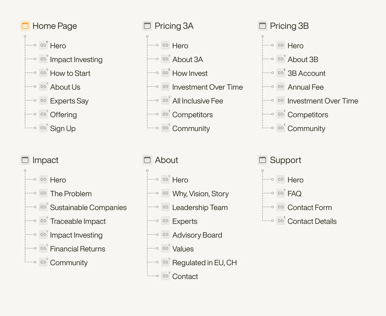
Rebuilding Information Architecture
We began with an open card sort informed by top Zendesk issues to map user questions against existing content. This highlighted gaps, redundant sections, and hard-to-find information, including the Inyova for Kids account. The new IA streamlined navigation, removed unnecessary pages, and introduced dedicated Trust, Impact, and 3A/3B pillar comparison pages, making key content easier to access and reducing support queries.

Design First vs. Copy First
After finalising the website’s information architecture, we split the work into copy-first and design-first tracks to let the marketing and design teams work simultaneously and avoid bottlenecks.
Copy-first pages required minimal usability changes, so the marketing team focused on rewriting the content using the Story Brand framework while the design team ensured layouts supported good UX.
Design-first pages needed more structural updates, so we defined section goals, added missing information, and redesigned layouts according to the new design guidelines.
Each page went through shared review and user testing to align messaging with usability.
User Testing & Iteration
We ran two rounds of moderated usability sessions with existing and new users to validate navigation, content clarity, and how quickly they could answer key questions. The tasks focused on finding critical information, understanding impact investing, and making sense of Inyova’s offering, as early sessions showed users were misinterpreting the differences between products.
Testing revealed several important insights that led to changes:
Adding an Offer page to consolidate 3A, 3B pillar comparison, and Inyova for Kids information.
Refining navigation labels to make key sections easier to find.
Keeping the parallax effect, as users responded positively to the interaction.
Clarifying some messaging to make information easier to understand at a glance.
The second round confirmed the new IA reduced confusion and made key content easy to access.

Reflection & Learnings
Balancing Brand & Usability
Creating a consistent grid and design system from layout fragments was a major challenge. It had to stay close to the brand feel while fixing structure and improving accessibility. The solution was to build a grid and modular section system based on the existing visual language, allowing us to unify layouts without losing brand identity.
Keeping Stakeholders Aligned
With marketing, design, development, and leadership all involved, alignment was critical but complex. We solved this through constant communication, collaborative workshops, and early prototypes that allowed all teams to review and iterate together, ensuring every decision stayed anchored in user needs.
Adapting to Changing Priorities
When the project paused and a new product launched mid-way, the information architecture had to be realigned without disrupting consistency. Because we had designed the site with a flexible page structure with clear purposes, we could easily adjust page structures and navigation to integrate the new product while maintaining a coherent experience.
Overall the result was a scalable, accessible website that improved content findability, reduced user confusion, and set a new internal standard for WCAG AAA accessibility and design consistency. The modular system created a flexible foundation for future products, sped up content updates, and delivered a more user-focused experience that strengthened trust.
Designing for Nasdaq Trade Surveillance: Making Market Abuse Visible
© 2025
Design and code by
Typeset in F37 Ginger by